We're almost through the coldest part of Winter here in Australia and the flowers in the garden are starting to grow again. Bulbs are starting to push up from the soil and the Wattle, a native tree is beginning to bloom. Spring is coming soon and I can't wait! I have not been very well this Winter and I am looking forward to warmer days.

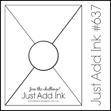
This week at Just Add Ink we have Choose Two Challenge from Tristan. She would like you to Just Add Two or more of Gingham, Circles, Flowers or Sequins. The design team have created cards with mixtures of combinations of these and we hope that you will enjoy playing along with us!

I have a special card for you today that I made for a lovely young person celebrating a special birthday. This is how the card appears when you bring it out of the envelope.
For the Challenge elements, I have used Flowers and Circles for my Choose Two items.
This card design is from Sue Campfield and she calls this design a Tuck and Reveal Fun Fold Card. I am guessing the name is because you Tuck the left side of the card in behind, in this case, the back of the circles to close it and the Reveal comes later when you open it.
I followed along with Sue's fabulous Youtube demo of this card from her blog but changed the dimensions slightly, just to lengthen the card to suit the C6 Envelopes we use here in Australia.

And here is the "Reveal!" When the card is opened, both the 3D tower and the raised square box element pop up. This design is perfect for a special occasion!
I chose to use the gorgeous Moonlit Flora DSP. The recipient is a lover of pink and I thought to mix the moody green with the little berry flowers paper with the pop of the berry diamonds for a contrast - and a berry surprise when opening! And whilst there is a room to address and sign the card here, there is a place for a message on the back.

The recipient can display the card without the message needing to be obvious.

The design in the circle was inspired by the DSP itself. The stamped floral spray is coloured with Blends and has some berry stamped leaves behind it and then the layers of different green, die cut leaves. I adore the amount of texture that is in these leaves and flowers. As someone with vision impaired friends and as a volunteer who has held card making classes for vision impaired people, I am always on the lookout for products that you can touch and note the texture. And these are some of the most detailed leaves I've found. I love the variety of the die cut leaves...some of them make me a little homesick for NZ too.

So my card has Circles and Flowers - and almost gingham in the pink - added. Which items out of Gingham, Flowers, Circles or Sequins might you add for our Just Add Ink challenge this fortnight?
You have until 7pm on Wednesday 26th August to enter your project and we'd love to see it!
You have until 7pm on Wednesday 26th August to enter your project and we'd love to see it!
Card stock: Secret Sea, Basic White, Silver Foil, Pretty Peacock, Granny Apple Green, Berry Burst.
DSP: Moonlit Flora
Inks: Berry Burst, Momento Tuxedo Black,
Blends: Berry Burst, Old Olive, Shaded Spruce
Stamps: Fern & Flora, Artistically Inked
Accessories: Die cutting machine, Spotlight On Nature Dies, Large Number Dies (retired), Fern & Flora, Silver ribbon, rhinestones.
Thanks for stopping by!
'Til next time,
Jan